Pick of the pencils
6 eye-catching campaigns from the D&AD awards
When Oscar season approaches, if there’s a film about war, race or sexuality, it’s pretty much a shoe-in for a gong. When it comes to D&AD pencils, the winners are usually big budget charity or public awareness campaigns. This year was no exception. That’s not to say the work wasn’t brilliant, of course. Just as Moonlight earned its academy plaudits, Channel 4’s Superhumans and Clemendger’s Meet Graham rightly deserve their black pencils.
But what about those winners that perhaps you might have missed? Those creative advertising campaigns driven by beautiful ideas and supreme craft that are busy being amazing quietly in the background. Here are our Creative Directors Dan and Lins’s pick of the pencils.
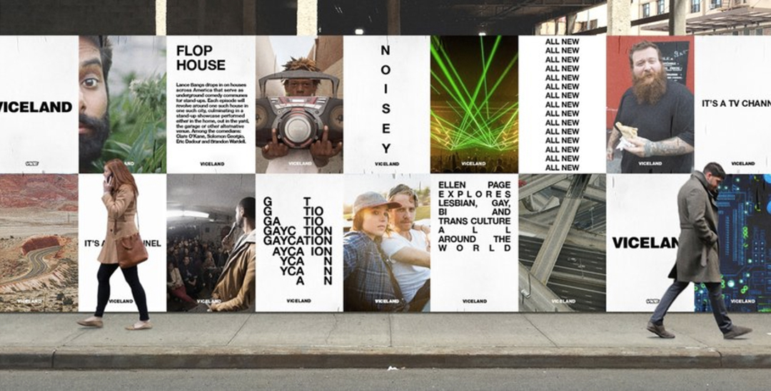
Dan’s Pencil Pick #1: Viceland TV branding for Vice by Gretel
First up, I’ve picked out Viceland’s TV channel branding by Gretel because for me, it strikes just the right chord between ballsy and understated. And that’s not an easy thing to do. Viceland has bags of attitude, it’s irreverent, unapologetic and its TV shows scratch the greasy underbelly of youth culture. Yet somehow it never sacrifices being ‘cool’ for artistic integrity.
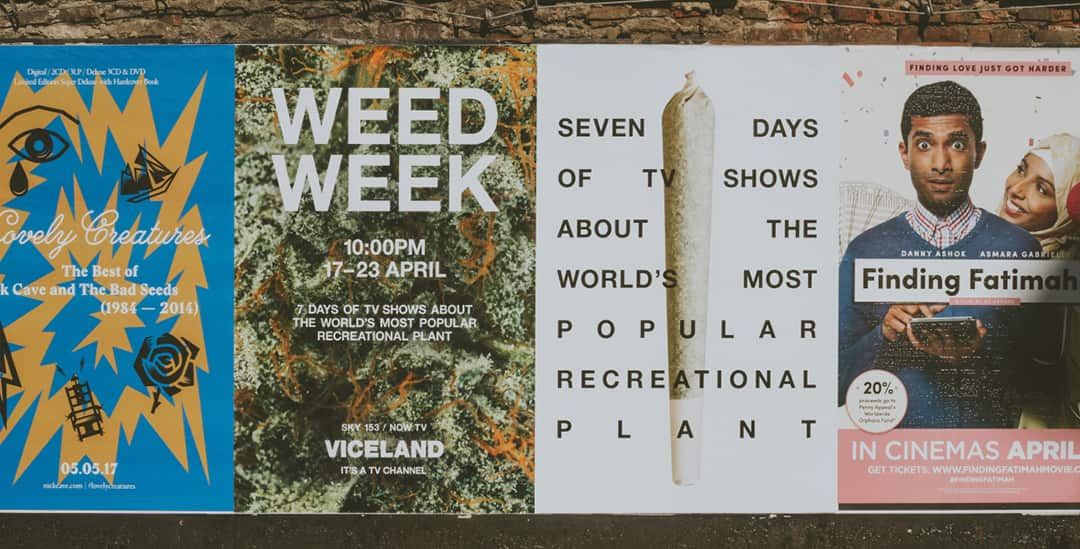
The use of Helvetica gives the ident a clean, minimalist feel but the playful way the typesetting is done is what gives it its edge. The contrast between the monotone copy and the full bleed images works really well. This is a brand who knows who it is, and more importantly, knows who it is talking to. Lovely stuff.
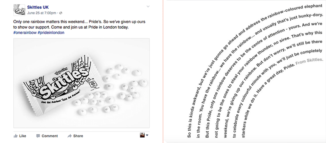
Dan’s Pencil Pick #2: ‘Give the Rainbow’ for Skittles by adam&eveDDB
When people think Skittles, they think ‘rainbow’. It’s their most recognisable brand asset. It’s on their packaging, in their slogan and even in the colours of the sweets themselves. That’s why getting rid of the rainbow in support of London Pride really stood out for me.
It’s a really simple idea that was perfectly pitched. The copy on the press ad is great and fizzes with Skittles’s leftfield personality, explaining how they didn’t want to steal Pride’s ‘rainbow thunder’. On social it went down a storm. The campaign with its #onerainbow hashtag earned 31 million impressions.
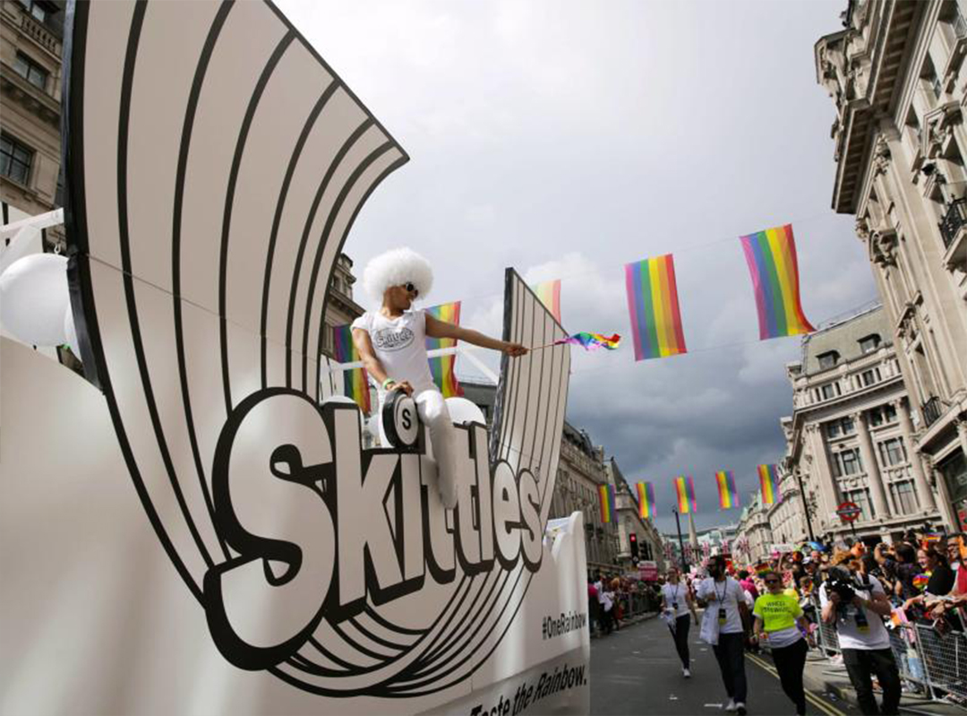
It was good to see the campaign extended into experiential with a rainbow-less Skittles float handing out limited edition ‘starkers’ skittles packs to revellers at the parade complete with white Skittles.
It earned Skittles the plaudit of ‘best newcomer to the Pride in London Parade’, which as you can imagine, is just as prestigious as a wood pencil.
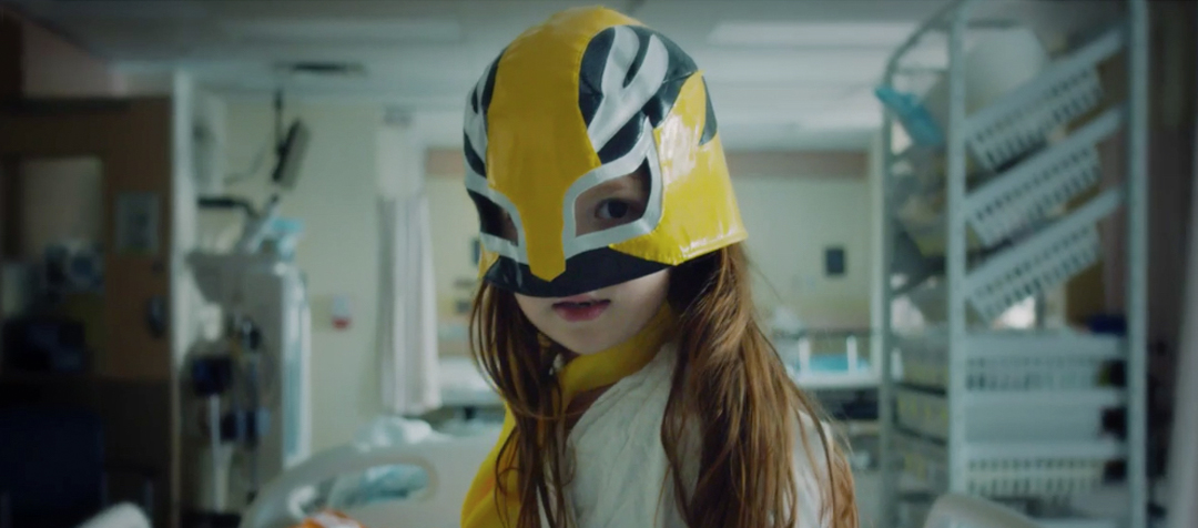
Dan’s Pencil Pick #3 SickKids VS “Undeniable” for SickKids Foundation by Cossette
If someone said here’s another poorly children’s charity ad, what would you be expecting? Slow, lingering shots filmed in black and white… True Colours playing in the background? Well, not this sick kids ad. Cossette have cleverly given the genre a full-throttle action movie makeover. And it’s stunning.
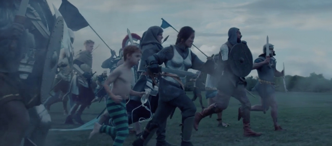
Working with the premise that sick isn’t weak, these kids are transformed from victims to warriors getting ready for battle. But it’s the soundtrack that makes it for me. The raw power of Undeniable by Donnie Daydream drives the film. And that heartstopping moment of reality halfway through leaves you holding your breath before the beat kicks back in.
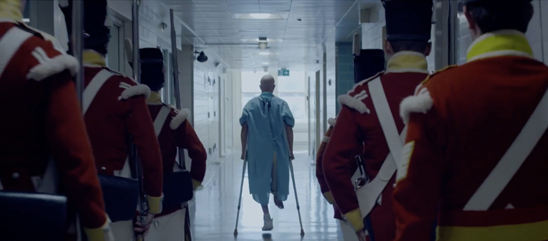
The mix of media used in the film is great too and blends a child’s imagination with the reality of a life spent in and out of hospital. We see a child entering the boxing ring in their fight against cancer, a girl becoming a luchador, kids in their pyjamas lining up on the battlefield with soldiers from the Middle Ages. All the emotion is still there. The pain. The hope. The fight. And it hits you even harder because you don’t expect it.
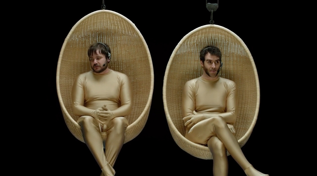
Lins’s Pencil Pick #1: BONDS ‘The Boys’ by Guilty
This campaign is a riot from start to finish. It’s no secret that underwear has a lot of comedy mileage but very few brands who sell it have the balls (excuse the pun) to play it for laughs. Bonds did. And with great success. They could have picked a run-of-the-mill campaign that banged on about their seamless stitching, or got a body-beautiful celebrity to show the product off, but why would that make Australian men pay any attention when it’s what everyone else is doing?
Instead they went straight to the heart of the matter and showed them exactly the impact a poorly fitting pair of undies is having on their crown jewels.
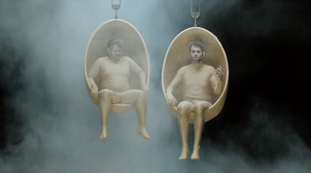
So we have two guys in gold lycra body suits suspended in egg shaped seats reacting to cold, heat, sports, attractive colleagues, talcum powder. Brilliant. I think out of all of them, the one where they ‘pop out’ during some lunges is my personal favourite. The dialogue, scenarios and acting are wonderfully executed.
And all the ads are underpinned by a strong message – men need to look after their balls. And the best way to do that, according to Bonds, is to keep them comfy in a nice new pair of Bonds undies.
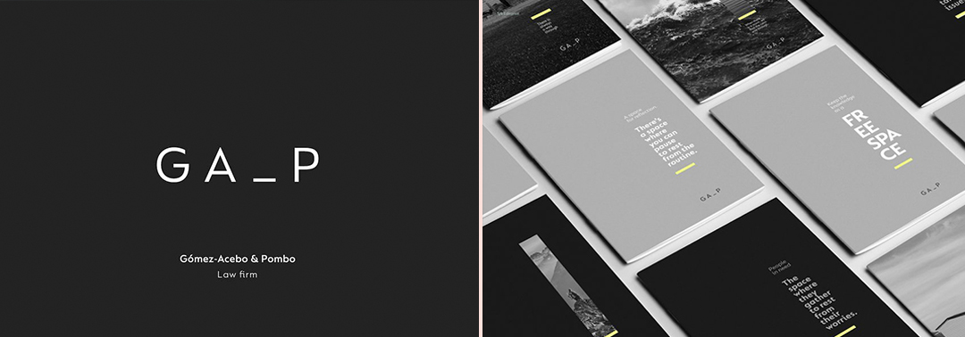
Lins’s Pencil Pick #2: ‘Filling the gap’ for Gómez-Acebo & Pombo by Interbrand
Law firms aren’t well known for their dynamic brand identities, which is exactly why I love this branding for Spanish law firm, Gómez-Acebo & Pombo’s. The idea behind it is simple. Their initials spell out GAP and as lawyers, they ‘fill the gap’ between problem and solution. The execution is both elegant and versatile.
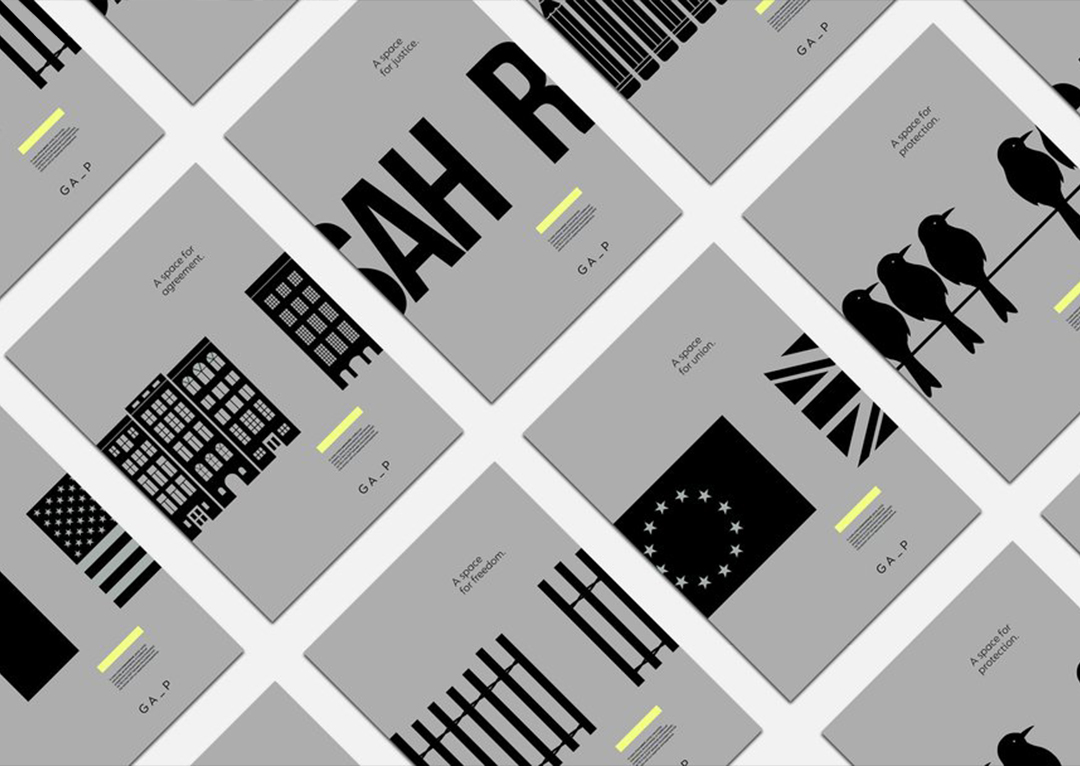
I especially like the way the ‘window’ graphic device is used and how it flexes across the various media.
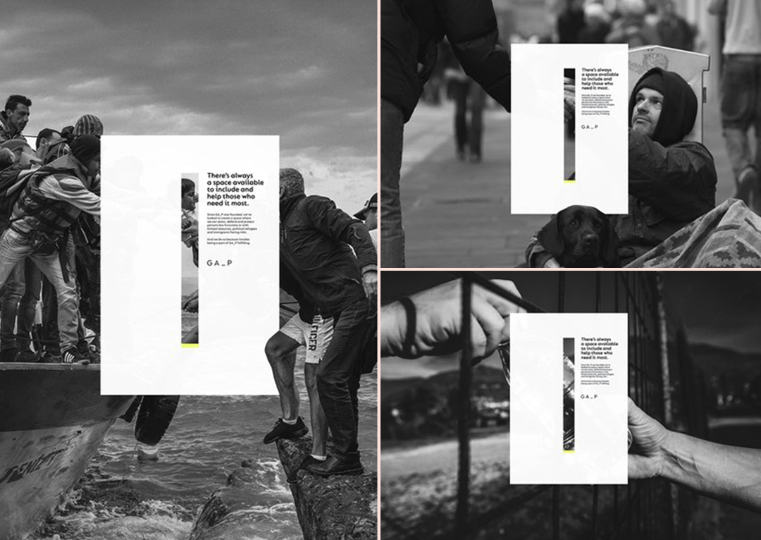
With Filling the Gap, Interbrand have created a platform for Gómez-Acebo & Pombo’s to tell their brand story, and to bring to life their mission to ‘assist, defend and protect’ people who can’t help themselves.
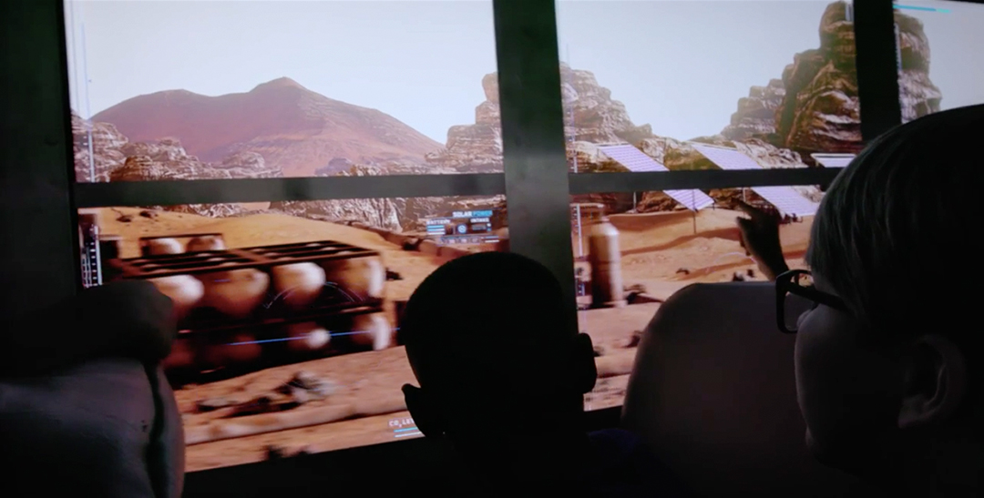
Lins’s Pencil Pick #3: The Field Trip to Mars for Lockheed Martin by McCann New York
Now, this project completely blew my mind. It’s not advertising in its traditional sense but it pushes the boundaries of storytelling, experiential and interactivity to places where no brand has gone before. To Mars, in fact.
The concept was to create the world’s first group virtual reality experience. How? By taking a bus load of school children on a virtual science field trip to Mars. The sheer scale of it is mind-boggling. Not helped at all by the fact that the technology to do it didn’t even exist at the start of the project. Yet after two years in development, a team of collaborators successfully created a tech-enhanced bus that mapped the streets of Washington DC to footage of a Martian landscape that was viewed through specially-formulated, interactive window ‘screens’.
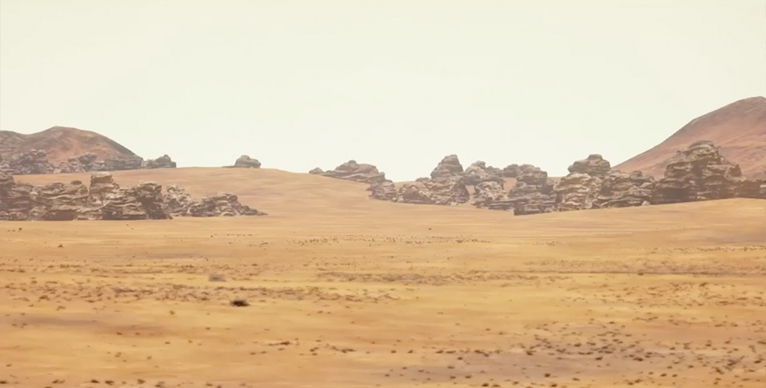
The whole point of this was to inspire future generations about the potential for space travel and exploration. It also expanded the minds of lots of creatives who never even dreamed that a group virtual reality installation like this was possible.
So there you have it. Our top picks. Do you agree? Get in touch on social media to share your thoughts and highlights.
To see some of our work in the FMCG, food, retail, health and wellness sectors, click here for case studies on how we’ve helped The Co-op, Atkins, Midcounties Co-op, Wagamama and many more.
Alternatively, if you’d like to learn more, give us a call on 0161 831 0831 and ask for Nicola or get in touch at hello@dinosaur.co.uk.
Also published on Medium.


